


What is the difference between standardised and normal abundance expression profiles?
At the Compound Statistics stage of the workflow, you are able to view run-by-run expression data for each compound across the different groups you have created in your current experiment design. Fundamentally, this is a plot of the compound abundance for each run, grouped by condition. However, the plot can be provided in two formats:
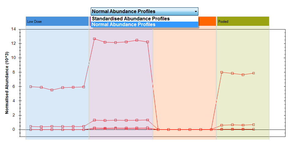
- Normal Abundance Profiles
- This is a direct plot of the compound abundance after normalisation.
- Standardised Abundance Profiles
-
This again uses the normalised compound abundance, calculated as for the previous option. However, the y-axis is then transformed - to show standard deviations from the mean. That is, for any given run, the point plotted will show how far the normalised compound abundance in that run is above or below the mean normalised compound abundance over all runs, after being divided by the standard deviation of those data.
Hence, a value of 0 would indicate that that run has exactly the mean value for that compound, and a value of +1 on the axis would represent a data point with a normalised abundance that is exactly one standard deviation above the mean of all runs for that compound.
You can switch between the two plots using the drop-down menu on this page:
The drop-down above the plot allows you to switch between the two options.
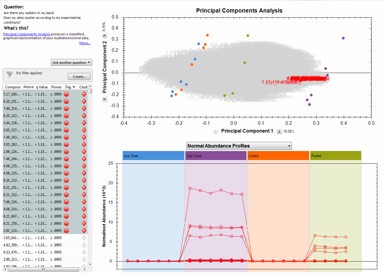
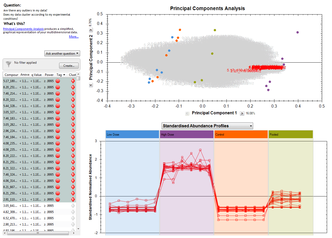
The benefit of having these two options arises because you can select and plot multiple compounds at the same time. For example, you may have highlighted a tag group filter you have selected to show a subset of your compounds, or clicked on a hierarchical clustering dendrogram branch to visualise similarly-behaving species:
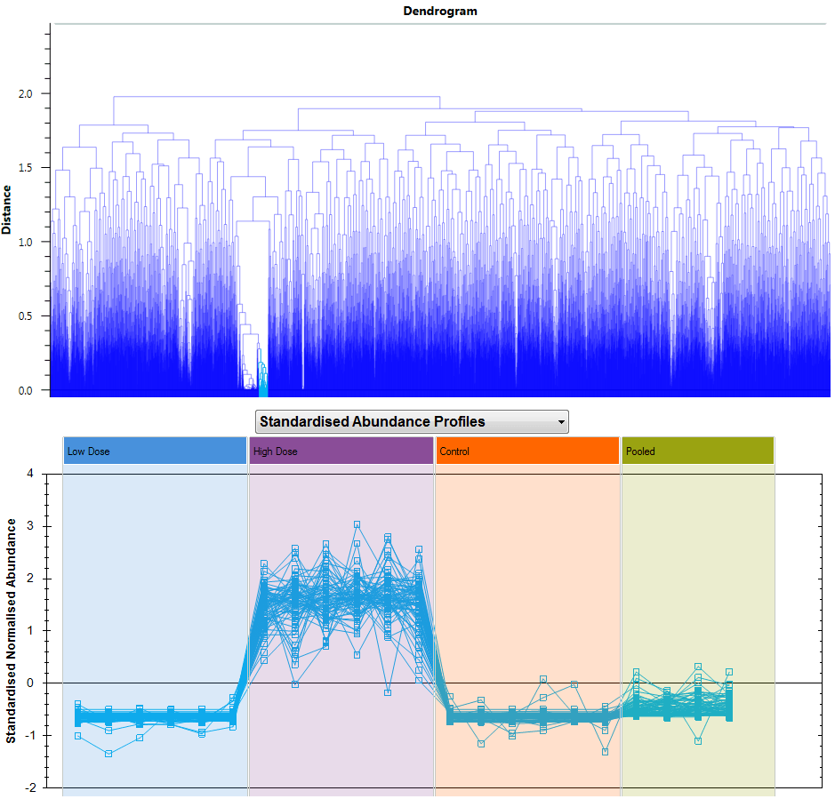
Selecting compounds to show, in this case having clicked on one branch of the dendrogram at Compound Statistics.
When you plot compounds with very different normalised abundances together in the Normal Abundance Profiles plot, the scale will adjust to include all their normalised abundances on one chart. This could mean that if you have a very wide absolute range, compounds with low abundance get "squashed together", as for the following twenty compounds:
Normal Abundance Profiles plot of twenty selected compounds among those significantly different by ANOVA for example data.
However, when you switch to the Standardised Abundance Profiles view, each compound is plotted in terms of its own mean and standard deviation, so all that all that matters is how high or low a run is relative to the mean and scatter of that same compound over all the runs. This removes absolute scale from the view, and so now compounds of very different abundances can be plotted together more effectively, showing the similarity or differences in their relative behaviour across runs rather than their absolute levels. In the examples from the previous figure, a correlation can now be visualised much more effectively when considering this plot:
Standardised Abundance Profiles plot of the same twenty compounds.
In this way, you can select whether you wish to look at the trends across absolute scale or with compounds all scaled to fit well on the same plot, as is most appropriate for you.
In both plots, hovering over the plotted point for a given run and compound will bring up a tooltip showing both those pieces of information:
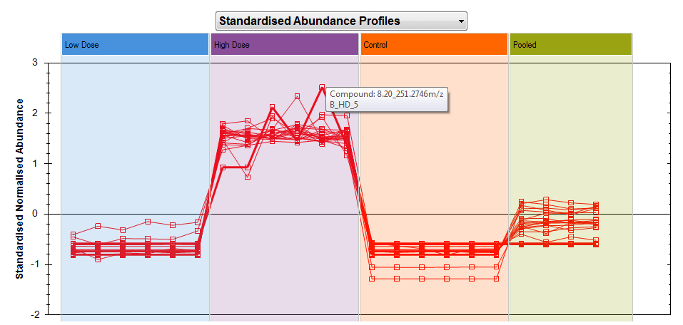
Hovering over a data point will tell you which run and compound it was generated from.