

Correlation Analysis
The correlation analysis is performed on arcsinh-normalised compound abundance levels. Compounds can then be clustered according to how closely correlated they are. Compounds with a high correlation value (i.e. close to 1) show similar abundance profiles while compounds which a high negative correlation value (i.e. close to -1) show opposing abundance profiles.
What can we do with this information?
Draw a dendrogram showing clusters of compounds according to how strongly correlated the compounds are. This correlation can be seen in the abundance profiles of compounds from the same cluster.
What is a Dendrogram?
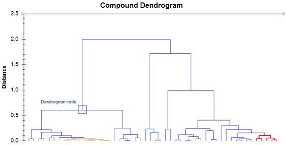
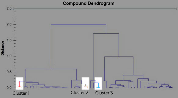
The dendrogram is a visual representation of the compound correlation data. The individual compounds are arranged along the bottom of the dendrogram and referred to as leaf nodes. Compound clusters are formed by joining individual compounds or existing compound clusters with the join point referred to as a node. This can be seen in the diagram above. At each dendrogram node we have a right and left sub-branch of clustered compounds. In the following discussion, compound clusters can refer to a single compound or a group of compounds. The vertical axis is labelled distance and refers to a distance measure between compounds or compound clusters. The height of the node can be thought of as the distance value between the right and left sub-branch clusters. The distance measure between two clusters is calculated as follows:
D=1-C
where D = Distance and C = correlation between compound clusters.
If compounds are highly correlated, they will have a correlation value close to 1 and so D=1-C will have a value close to zero. Therefore, highly correlated clusters are nearer the bottom of the dendrogram. Compound clusters that are not correlated have a correlation value of zero and a corresponding distance value of 1. Compounds that are negatively correlated, i.e. showing opposite abundance behaviour, will have a correlation value of -1 and D = 1 - -1 = 2.
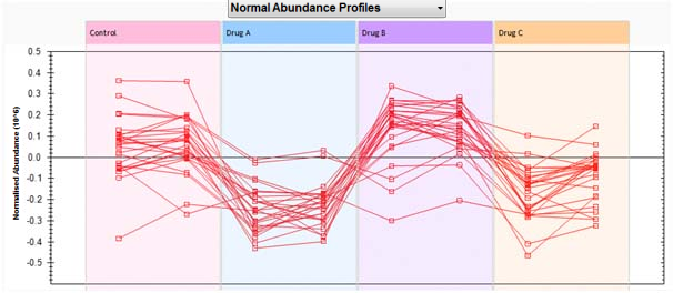
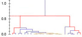
As we move up the dendrogram, the compound clusters get bigger and the distance between compound clusters increases in value. It becomes difficult to interpret distance between compound clusters when compound clusters increase in size. A possible way to think about the abundance profile behaviour of two compounds would be to see how far up the dendrogram you need to go so you can move between the two compounds. In the dendrogram below, you see that to get from the compound on the left to the compound in the middle, you need to move up a distance of 0.6 (just follow the branches).
Therefore, you would expect the same general behaviour for these compounds. This can be seen in the following abundance profile graph
Now, compare the following compound clusters. Cluster 1 (left side and in red), cluster 2 (middle left and in brown) and cluster 3 (middle right and in blue). This illustrates the degree to which you can comment on the distance between compound clusters.
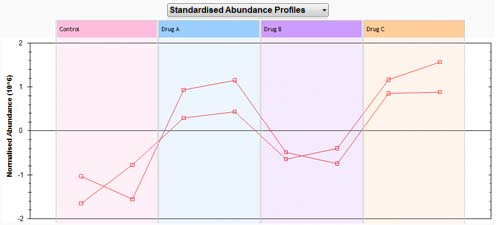
The abundance profiles for compounds in those clusters are show below.
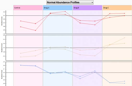
Finally, looking at all the abundance profiles on the main right hand branch, we see that while abundance profiles are generally quite similar, there is certainly a variety in individual abundance behaviour. In other words, as clusters increase in size, their abundance profiles become more general.