


How do I use the QC metrics peptide ion dynamic range chart?
This chart shows the proportional distribution and range of the normalised abundance of the peptide ions present, considering only data in the current experiment design. Each peptide ion in the aggregate profile is assigned a single normalised abundance value in this chart. The assigned value is the log10 of the highest mean normalised abundance value for the peptide ion in any condition. The data are then plotted as binned columns, representing the proportion of the total.
Successfully identified peptide ions are shown within the bars in yellow, to allow visualisation of the proportion of peptide ions that have been successfully assigned to peptides and how this relates to normalised abundance.
The kinds of problem this chart might reveal include right skew or a curtailed distribution of the total density, potentially indicating saturation at high abundance. Also, if the proportion of identified peptide ions is relatively right-skewed, with relatively few at low abundance, you may wish to improve your identification coverage through inclusion/exclusion lists or different fragmentation strategies (for example). The example image demonstrates a case of more successful identification of more abundant peptide ions.
If you wish to examine the raw data, it is possible to turn off normalisation at the Filtering window in the workflow (Review normalisation | Normalisation Method tab).
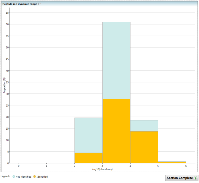
The Peptide ion dynamic range chart. Note the increasing proportion of identified peptide ions at higher abundance.
See also
- How do I use the QC metrics screen?
- How do I use the QC metrics overview screen?
- How do I use the QC metrics identifications overview chart?
- How do I use the QC metrics LC peak width chart?
- How do I use the QC metrics precursor m/z chart?
- How do I use the QC metrics precursor retention time chart?
- How do I use the QC metrics mass errors chart?
- How do I use the QC metrics precursor charges chart?
- How do I use the QC metrics missed cleavages chart?
- How do I use the QC metrics peptides per protein chart?